
The first look at a website can leave a lasting impression on a visitor. Maybe they don’t like what they see in a picture, they can’t understand your navigation menu, or they don’t want to put in the effort to find the information they are looking for. You don’t want to lose a potential lead because of that. The first content they see in their browser on their first visit will either make them want to scroll or leave: This area of the website is known as “above the fold.”
Having strong content and engagement above the fold will make people want to look at what else you have to offer. Does your website have strong above the fold content that will increase your leads? Here is a snippet from the 47-Point Website Homepage Checklist to show you the elements that will help gain leads.
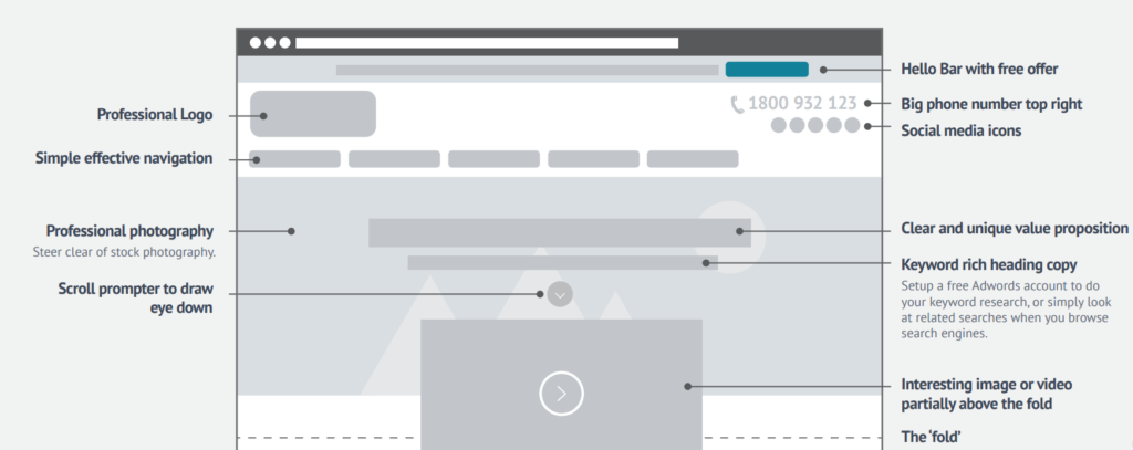
This image depicts what people will see when entering a site – the above the fold content.
Let’s go through this step by step, from the top to the bottom.
Hello Bar
At the top, we have a “Hello Bar” that acts as an initial, consistent call-to-action throughout your website. This is a great place to offer a white paper, a promo code, or even a free offer. This can be accomplished through plugins or extensions from other sites.
Professional Logo
Next up is your logo. Having a good-looking logo can really help create a sense of legitimacy and trust with your customers. Some will think having a large logo in the center of the page would be better, but your customers aren’t here for your logo: They are here to learn about you, your services and products, and to hopefully purchase.
Phone Number
It’s important to have your phone number appear nice and clear at the top of your page. Having your phone number high on the page will help increase your call conversions. If someone wants to call you, they don’t want to go digging for the number. Make sure this is a click-to-call link on your mobile site, so people just need to tap it to call you rather than entering in the numbers.
Social Media Icons
Potential customers don’t stop at just your website to know more about you. Social media is where people see what you’re talking about, what you’re promoting, and how others are engaging with you. They’ll look at your content as well as reviews and comments left by other viewers. This is a great way to show transparency and that there are more ways to engage with you.
Simple Navigation
Have you ever been given directions to someone’s washroom in a large house and forgot them halfway in? It’s not a great feeling not knowing where to go. Give people a simple navigation menu with specific titles so they know where they are going. If you are utilizing dropdown menus, try not to make them too long or have too many sub-menus. Simple and clear navigation will get your customers to where they want to be, so they can learn or purchase what they need.
Header Image
Having a large and responsive image at the top of your page will give you a chance to both show off your product/service as well as engage the visitor with this information. Some people will resort to a stock image for this, but people are there to see you and your business. This unique content will show off what you can do for your customer more effectively than a stock image.
Clear Value Proposition
On top of your header picture there should be, in a nice big font, a clear and unique value proposition for your visitor. It should be a quick descriptor of what you do, who you are, and what you can do for them. Treat this as a call-to-action for your entire business. You want your visitors to see this and want to know more about your business, or even better, want to purchase from you.
Keyword Rich Heading
This subheading is your tag line. Really sell them with this line while also focusing on the keywords you want both people and Google to see. There are only a few opportunities to organically throw in your keywords and services without looking spammy, so take this opportunity to focus on them now. To really find the keywords that will work best, you can set up a free AdWords account with Google and use their Keyword Planner to see what people in your area are searching. The more impressions, the better.
Prompt to Draw the Eye
Our eyes are trained to follow arrows and lines. Adding a small button with an arrow will either drop people down the page or draw them to click it. You can add code to this button to have the page scroll down to anywhere on the page, be it right below the fold or to a specific area of content that you advertised next to the button. This will help direct people to popular services or products without making them look around and giving them the chance to leave.
Engaging Content
The last element to an optimized above the fold design is an engaging piece of content, be it an image or video. Having this only partially shown above the fold will force people to scroll down the page to see the full piece. This initial scroll will help entice them to keep scrolling and exploring your site. This piece of engaging content is also important to show off your business more and to get people interested in your services or products.
So, how does your website stack up? Are you already utilizing some of these elements in your design? We’ve spent a lot of time and effort researching these elements, and we found that adding these to your design will bring in more leads and increase website engagement. But it doesn’t just stop here. This was only 10 points from our 47-Point Homepage Checklist. There’s still plenty more that you can do to help bring in more leads from your website.
If you think your website could use some improvement, be it some of the elements we talked about here or even a complete website design overhaul, don’t hesitate to contact us. We would love to help you get those leads you’re missing out on. You can call us at 302-259-1644 or send us a message via our contact page.