Lead Magnet
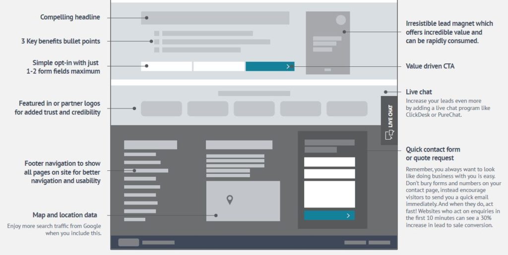
You might recognize this section from our Part 3 of this series. It’s a little different in that it is part of the home page rather than a popup a visitor can just close. This area gives you much more room to give the visitor a sense of what they can get from you for free. Let’s talk a little bit about what this lead magnet could be for your company.
The easiest answer would be a download link for a free book that you’ve written. Doesn’t have to be long, or short, it just needs to be enticing enough for a visitor to want to read or have. This could also be a brochure with more information about your services or products. It could be a file ties into your business, such as an Excel sheet, Powerpoint, or chart. Infographics also work well here to give them your visitors an interesting piece of content that they will want to hold onto. Give your visitor something they want, not something you want them to have, and you will be surprised how much people will download it.
Compelling Headline
Like I said above, give your visitors what they want. Show them what you have and why you want it in a single compelling headline. You’ve got them through the door, now tell them what they could have in seconds after a single click. Tell them how it will benefit them (more of that in the coming paragraph).
Here’s a few tips on how to write a good headline:
- If you have numbers, use them. People like to go in expecting a certain number of items or information. (Ex. 8 Things for Better Leads)
- If you don’t have a number, use a trigger word such as “what”, “why”, “how”, etc. Using both a number and a trigger word might be too much for your headline, so experiment with what you have. (Ex. How to Get Better Leads)
- Create interest with interesting adjectives. Again, we’re trying to make people feel a certain way and be drawn to our content or freebie. (Ex. Top 8 Essential Things for Better Leads)
- Rationalize your headline, especially for a list. Don’t just use “things”, describe more about what they can expect. (Ex. Top 8 Essential Secrets for Better Leads)
- Promise them something, but don’t lie. Make sure they know what they will get out of your document with tis promise. (Ex. Top 8 Essential Secrets to Gain More Leads).
3 Key Benefits Bullet Points
Here’s your quick sales pitch for when just the headline isn’t enough. List out the key benefits or purposes your freebie has to your visitor. Tell them what they can expect to learn from it, what they can get out of it, and how it can affect them after downloading it. Make them skimmable so people can read easily and add formatting if necessary like italicizing, bolding, or underlining key words or sections.
Simple Opt-In with a Value Driven CTA
After giving your visitors a rundown of what kind of freebie you’re offering them and what the benefits are to the people that download it, its time to get something in return. In exchange for your resources the visitor will need to opt-in by giving you their name and email. There are different things you could ask for to opt-in for downloading your document, but try and keep the number of fields low so the task isn’t daunting for the visitor.
One very important thing to mention is that if you are asking for their email address and intend to use that information to send them emails about your business, be sure your opt-in form requests permission to do so and that it is clear that this is the intention. There are rules and laws governing emailing and doing email advertising. Two major rules for email advertising are:
- Make sure you ask for permission in your opt-in form.
- Include an unsubscribe link in your campaigns and abide by them.
Featured In or Partner Logos
You may notice at the bottom of other company’s websites, and sometimes in sidebars, you will see a bunch of logos for other businesses lined up together. These are affiliate businesses, partners, and badges from other sites (such as BBB.org). These logos and badges are here to promote legitimacy, trust, and credibility. Linking out to these other sites can also be helpful with showing legitimacy with Google’s crawlers and robots. It’s even better if you can get the companies to link back to your site as well creating more backlinks to your site.
Live Chat
Another source for generating a lead is by adding a Live Chat plugin to your website. With this feature added to your site, you will be able to communicate with visitors immediately while they are on your site. You can answer questions, give them more information, and anything you need to do to give your visitor good customer service. Many consumers judge companies by how well their customer service is, deciding if you deserve their business or not. Showcasing this can be a little difficult online, so adding a live chat can help with that.
Footer Navigation
In the first column of your footer is the usual place for your navigation tree to be shown. At the top of your page, or screen, is your navigation bar, and at the bottom of the page is your navigation tree which will showcase all of your pages. It is a likely case that visitors will not hover their mouse over every button or ever image and will then miss out on information that could prove useful to them. This navigation tree will showcase these hidden pages so your visitors can find them and potentially convert.
Map and Location Data
Google, the biggest search engine, loves when websites play by their rules and use their tools and features. These are ranking factors Google looks out for and will give more preferential treatment to the website which can result in more search traffic. But adding a map and address to your footer will do more than that, it will give your visitors a place to find where your business is located and giving directions to visit you. Adding a map can help with both online traffic and foot traffic, so make sure your customers can find you and add one to your footer.
Quick Contact Form
The last thing to add to your footer is a quick contact form. This doesn’t need to be as long as your full contact form likely located on your contact page or another landing page All you need is some defining information like a name, phone number, or email address as well as a larger box for your visitor to write you a message.
Go Get Your Leads Today
That covers everything we have in our 47-Point Homepage Checklist. Now that you know more about all these sections of your homepage and website you can put it into overdrive and bring you in more leads, conversions, and sales. If you have any questions about what we covered here, questions about our checklist, or looking for a website designer to fix up your site, give us a call at 302-259-1644 or send us a message on our contact form.

